Initial Proposal
So as a reminder here was what I wanted to do:
Link to Initial Final Project Proposal
The idea was to work with data sets with information on MTA stations—specifically, their ridership information and which ones are/are not accessibility friendly. By comparing and mapping this information, I hoped to create a list of stations with highest ridership that do not have accessibility services. From there, the idea was to profile surrounding neighborhoods of five from the top 10, later more deeply profiling the surrounding areas of 3 of those 5.

The ultimate goal was to have the information I’ve found and collected exist as a resource that could potentially be used by community members.
The Process
Throughout the semester, we were given different readings, discussion points, and introductions to different tools as part of the course material. Through learning about and getting to know the material better, we were tasked with activities—which we were encouraged to use in building toward our final projects. I took advantage these opportunities.
Here’s what I worked on over this course this semester:
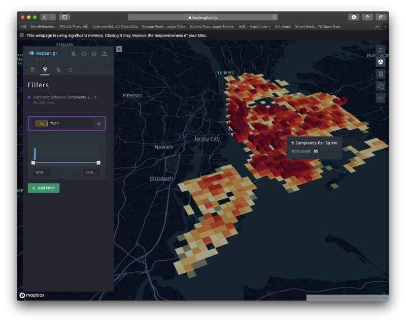
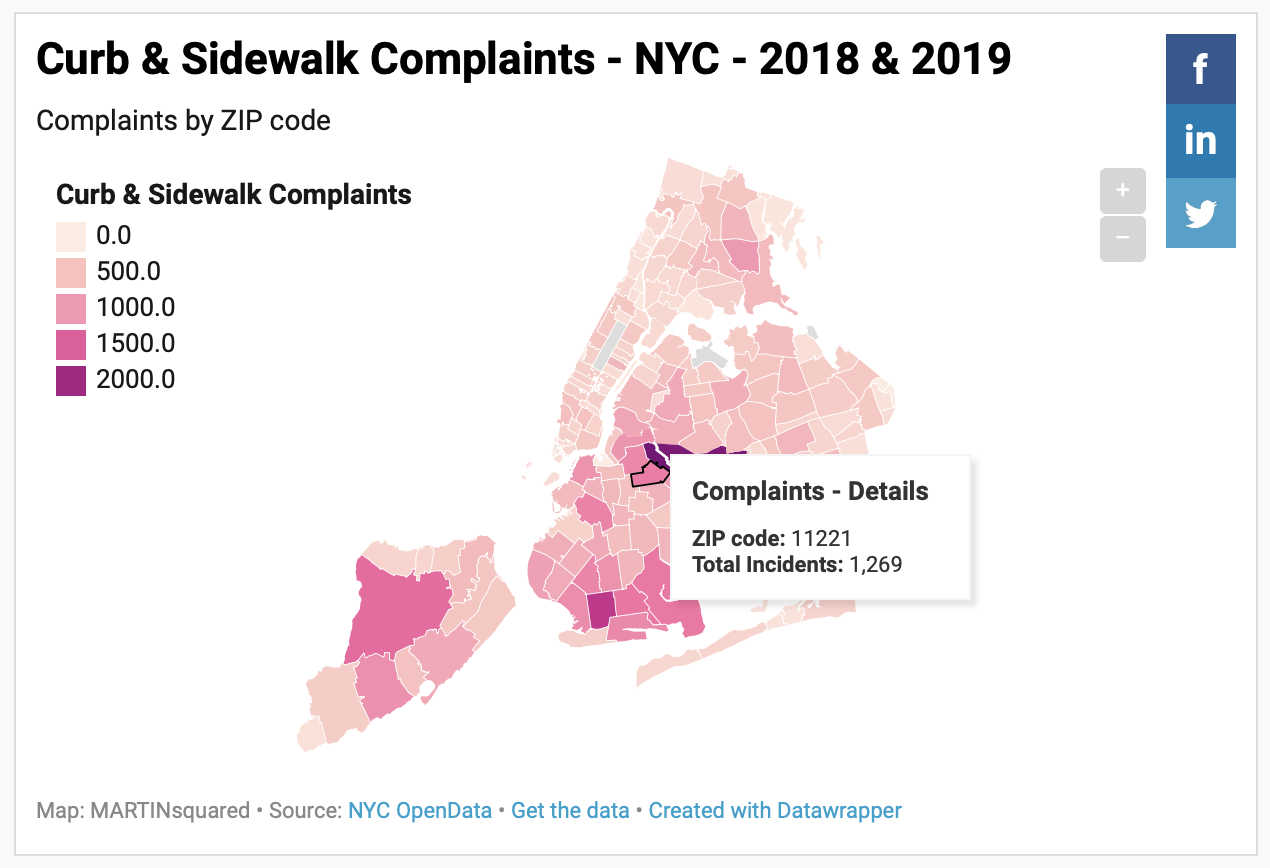
Choropleth Mapping – Curb and Sidewalk Complaints in NYC
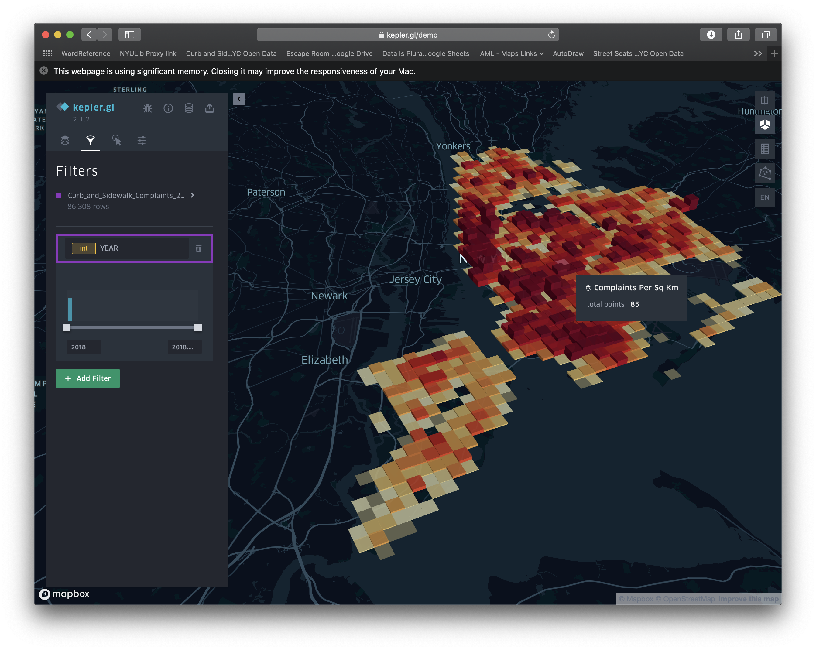
I struggled a bit with using a lot of the mapping tools, but was able to get some pretty simple, but engaging results by using Kepler.gl and Datawrapper.de. I used data from NYC OpenData. What I found was that most of the areas that aren’t easily accessible are areas with the highest numbers of curb and sidewalk complaints. The complaints include things such as damaged, cracked, and uneven curbs and sidewalk surfaces that can be not just uncomfortable obstacles, but safety hazards that get in the way of people with accessibility needs just getting to the stations.
More Mapping – Mapping ADA Compliant Stations (compared to all stations)
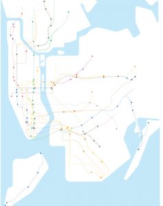
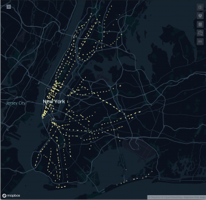
The coding struggle continued. I spent several hours trying to learn to use Turf and Mapbox to little avail. In the end, I wound up using Kepler.gl to create a map representation of the ADA compliant stations of NYC’s subway system along with a map of all of NYC’s subway system’s exits. It’s one thing knowing the numbers—only 121 of 472 stations entrances/exits are ADA accessible, though only 96 stations of 424 (23%) are ADA accessible. However, seeing a visual representation of where they are presents a-whole-nother picture (pun intended.) *I also mentioned I wanted to look into doing some hexagonal grid maps of data relevant to this project.*
A Compassionate Compass – A Customized Compass for the Differently-Abled
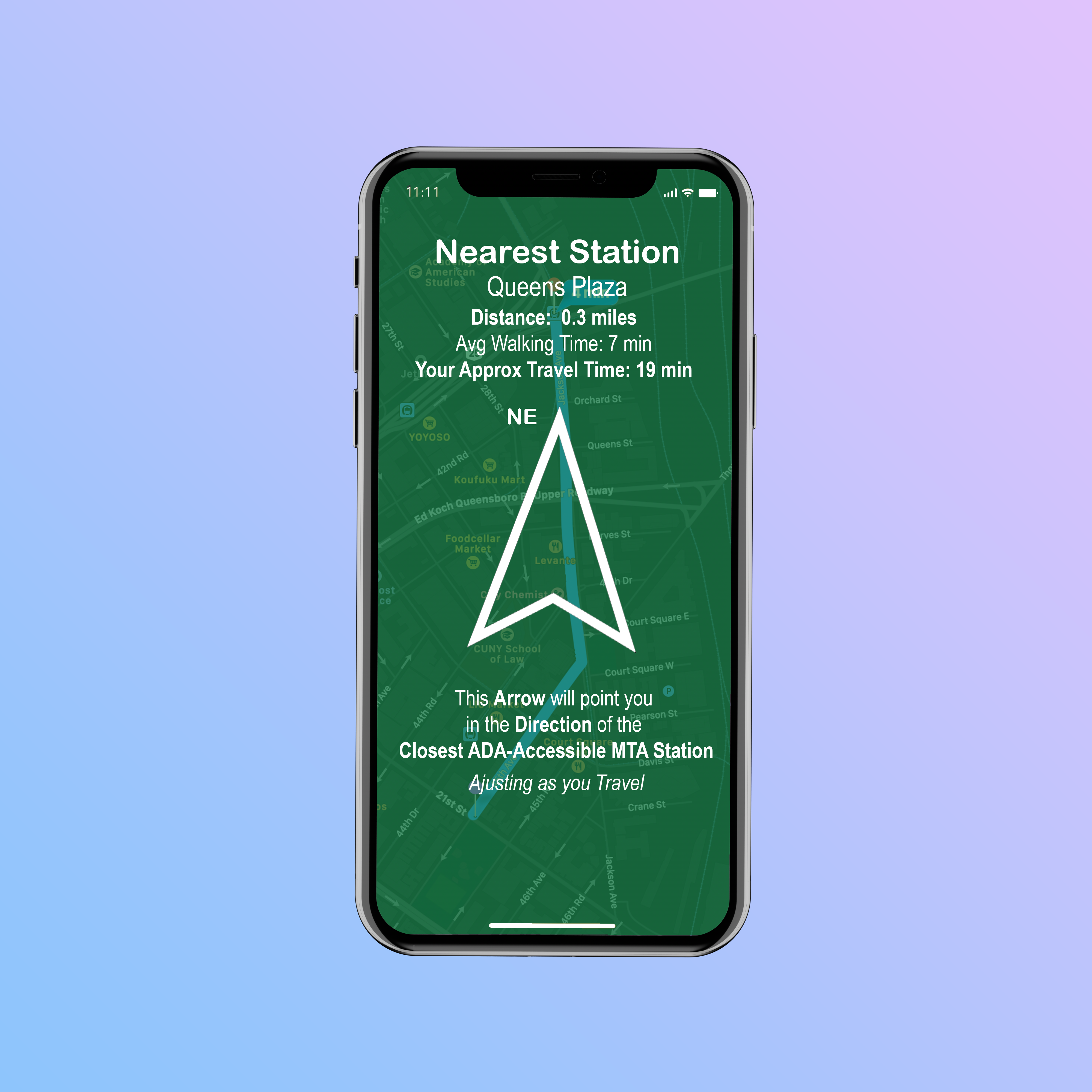
After speaking with the professor, Joey, I decided to spend less time focusing on getting the more complicated mapping tools and more time focusing on the driving ideas behind the data. This week we were given a prompt to create a compass that adjusts depending on the location of your physical data. Because my project deals with accessible stations of New York City’s subways system, I decided to develop the idea of compass that would guide users to the nearest ADA accessible station—a customized compass for the differently-abled. This compass would allow users to find the closest ADA station entrance/exit and navigate the streets to get there however they’re most comfortable. The compass would allow users to customize and adaptively update their average travel speed to better be able to get a user-specific Approximate Travel Time.
What Picture Do These Projects Paint?
So, looking at the maps and projects I’ve complied over the course through weekly projects, I think an introductory, but effective is conveyed. It’s simple: New York City isn’t friendly for navigating for those with disabilities. In addition to areas dense with curb and sidewalk issues, the location of ADA accessible stations are spread out and insufficient—imagine only being able to use 25% of the stations on the subway line! It’s unacceptable.
What About That Goal of Making a Hexagonal Grid Map?
I’m glad you asked about my hexagonal grid map. This semester didn’t end the way anyone expected when it started out. Being thrown into a new way of holding class, definitely affected the flow of the course; I wasn’t really able to take advantage of the advanced mapping software as I’d hoped. I also found I was spending a ton of time researching data sources that fit my need and then massaging it and pulling in other data to get what I needed. As I related most to the conceptual aspects of the material—particularly the idea that even slight adjustment in the displaying of the data can reflect massively different results—I wanted to see if I could use a new hexagonal grid map to convey this.
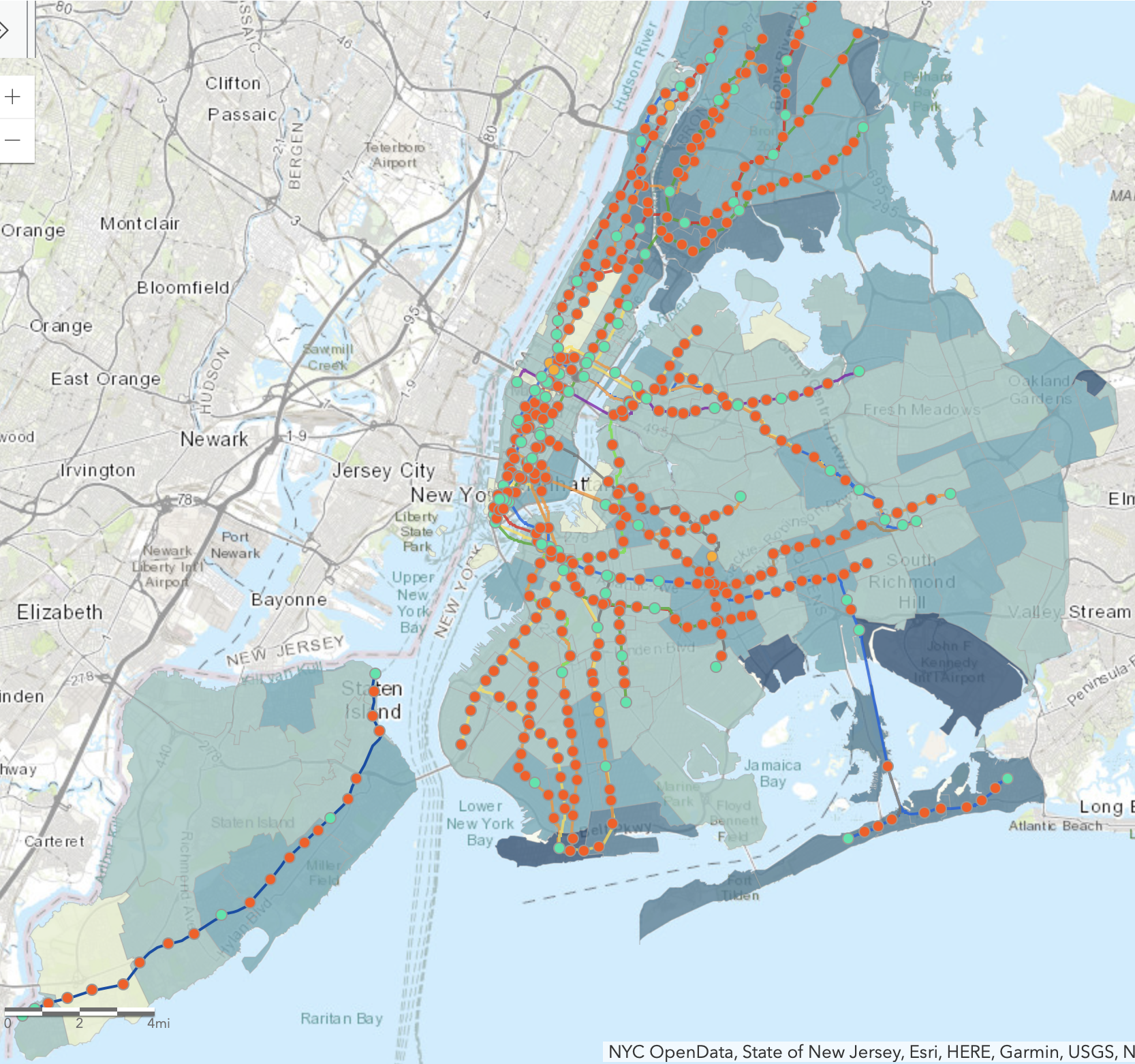
I started by referring back to maps by the Center for the Independence of the Disabled, NY (CIDNY) that showed information that I found interesting and wanted to further explore. Unfortunately, I wasn’t able to track that data down. Interestingly, it only showed that their maps were based on data from NYC OpenData and The State of New Jersey; this wasn’t helpful and led me down a rabbit hole of related, but not-quite-what-I-wanted data. This should actually be seen as more of an issue than it probably is by most, since there’s no clear indication of where their data came from.
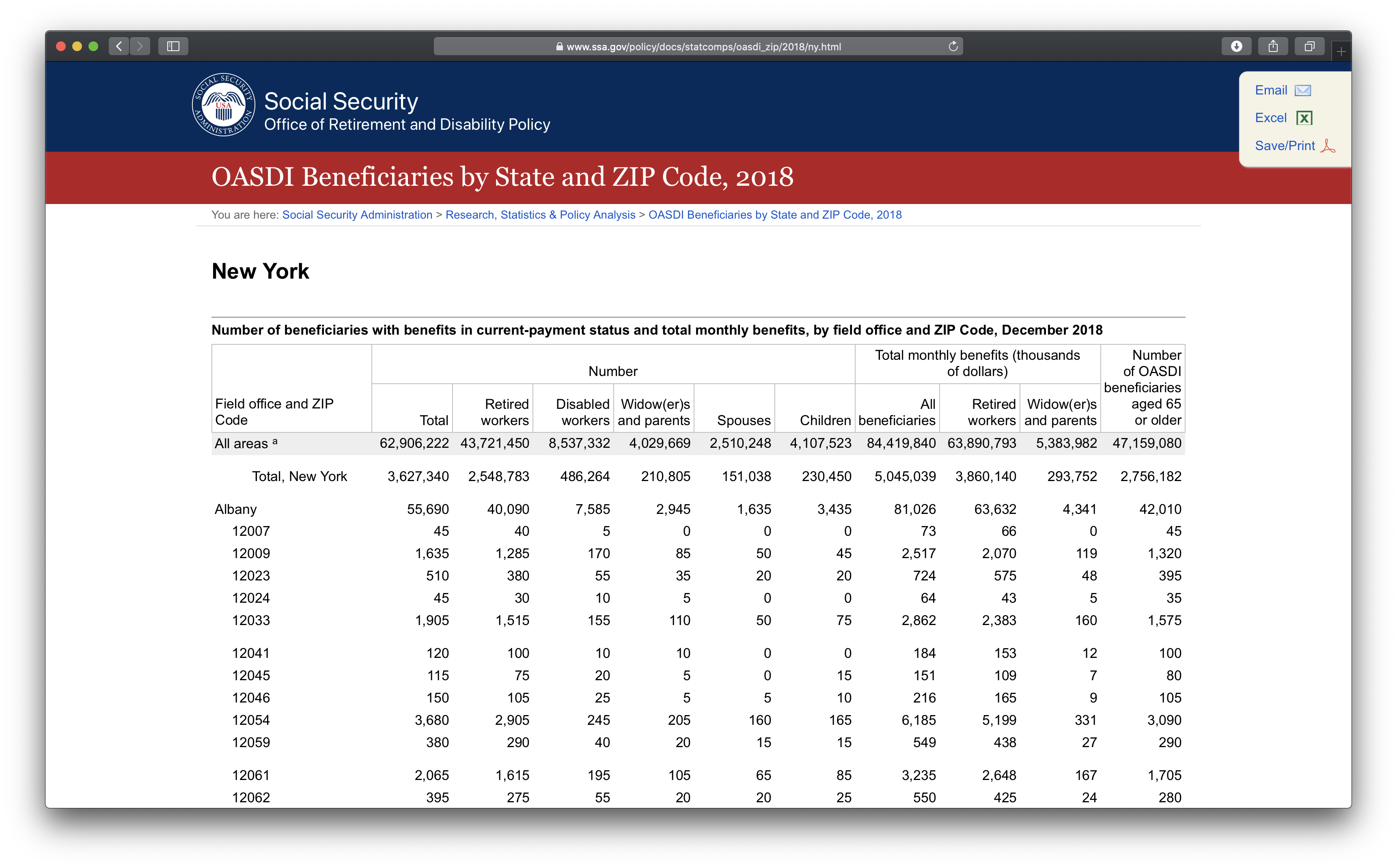
So, I ended up making my own maps and sourcing my own data. I ended up using information from the Old-Age, Survivors, and Disability Insurance (OASDI) program of the Social Security Administration (SSA). I took their dataset for the state of New York called “Beneficiaries by State and ZIP Code, 2018 (Released July 2019)” and selected the columns for the Retired Workers and Disabled Workers and sorted by zip code to get only data for the NYC boroughs. I didn’t have the location information for each of the zip codes, so I downloaded a list of them with latitude and longitude and then meticulously combined the two in order to be able to upload it to Kepler.gl.
Here’s what I came up with:
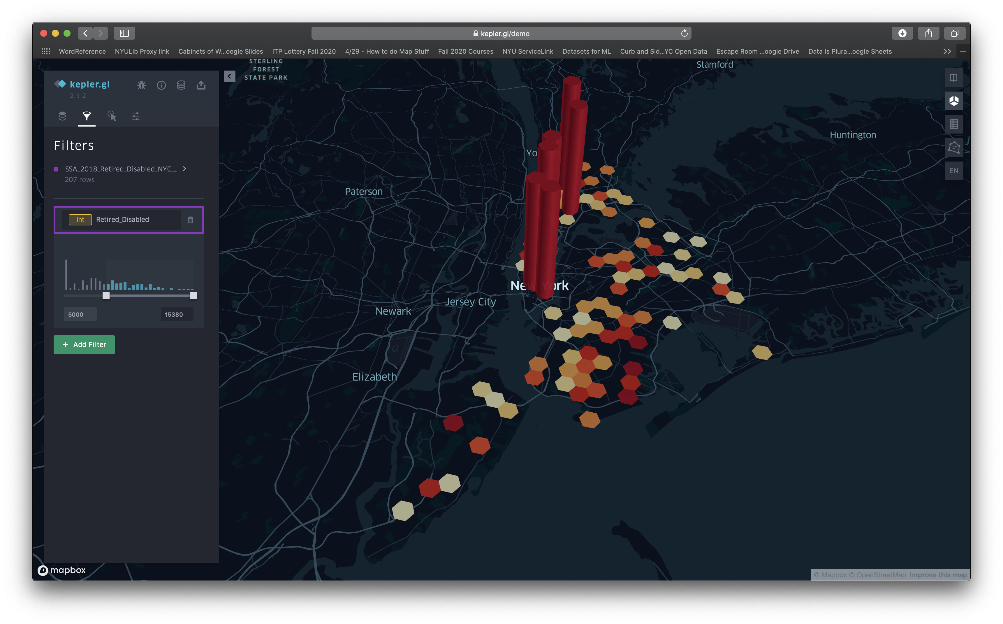
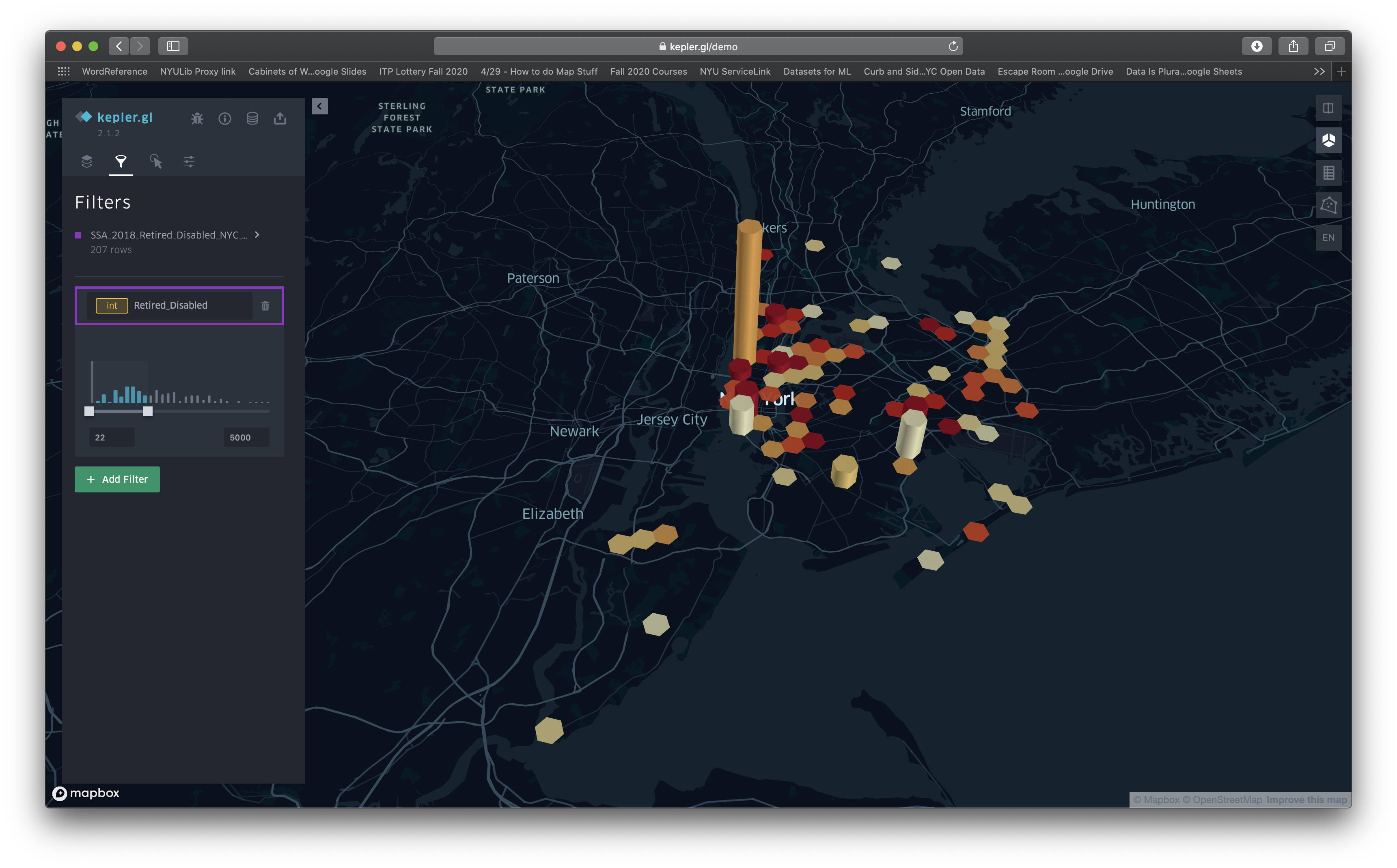
If you’ll notice, each hexagon in the grid represents a 1km (0.6mi) area; however, those areas are centered around the locations for the zip codes. Because the zip codes in Manhattan (the island on the left in the map) are closer to one another, this data is more likely to overlap. Had I not expressed this, the map reader could be easily deceived. Despite having a reputable resource for the data, these maps are clearly skewed. Notice how the map with a threshold starting at 5,000 recipients of OASDI benefits emphasizes areas in Manhattan as most important. It looks really different from the one with the lower threshold.
Final Thoughts
Despite the fact that more than just disabled people can reap the benefits of the universal design that ADA accessibility features provide, from the maps, would you, dear reader, have drawn a map for where accessible stations should be the same as this one?
Had I wanted to obscure or manipulate details, I could have just cited the data as being from the SSA and shown the reader what I wanted to convey…. an example of how data sources and presentation matter! I clearly stated where my data came from, but not everyone does—transparency in detail and source are important!
Here’s a copy of my final presentation:

