Grafana
This week we used a couple of graphical interfaces in class to learn different ways to access and manipulate the data we’ve collected (and then some.)
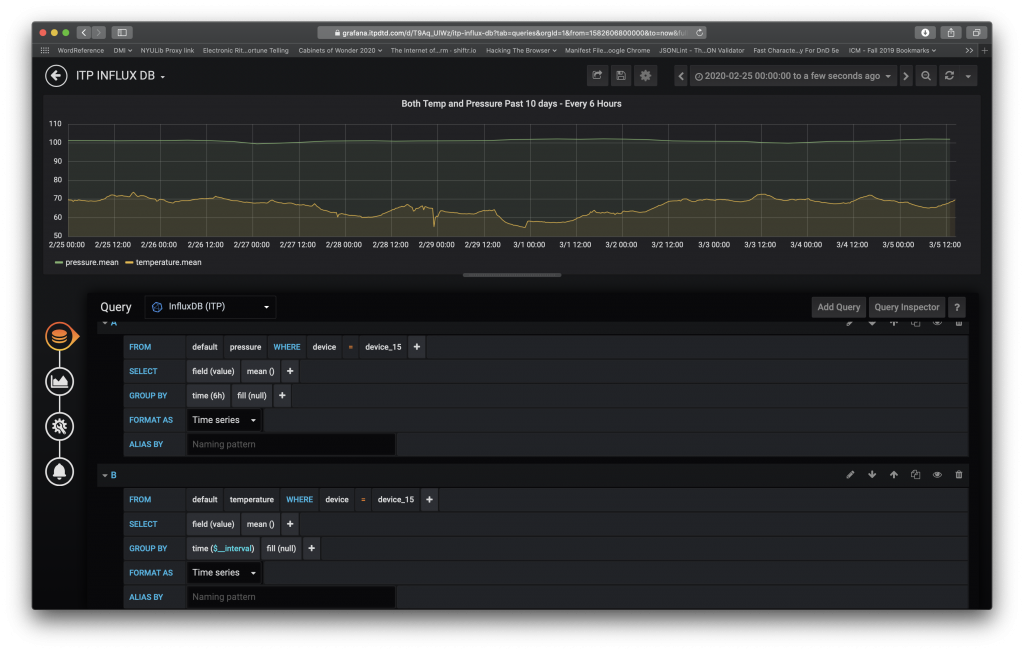
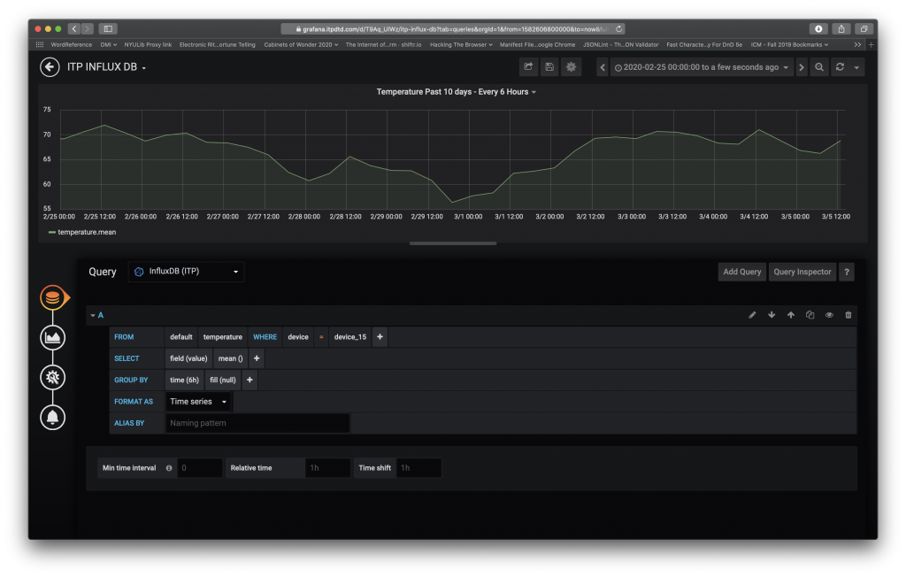
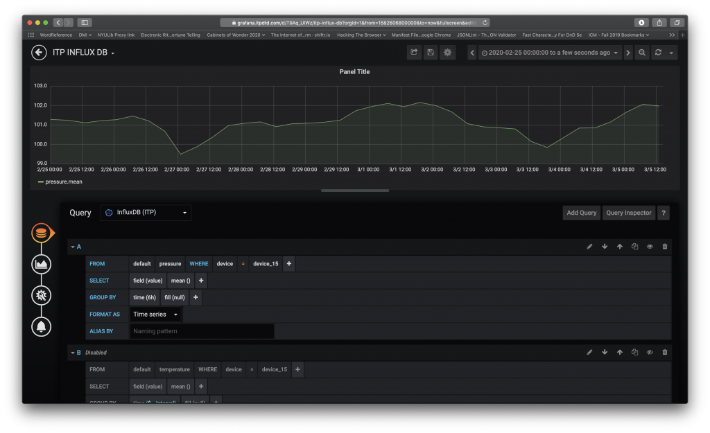
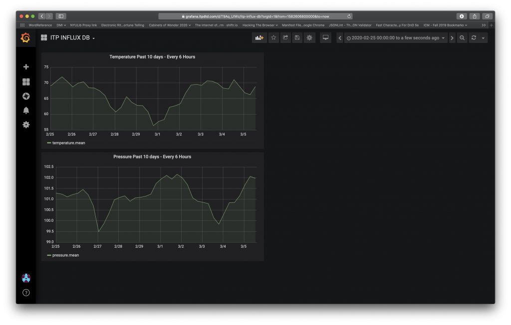
For my projects for Grafana, I looked at temperature and data over the previous 10 days every 6 hours. Initially, I tried putting the two measurements on the same graph; however, this heavily muted the variances in pressure (in green.)
As you’ll see below, having the graphs side-by-side is much more effective in getting information.
Node Red
UPDATE: Corrected time zone difference. (3/8/20 – 6:10PM EST)
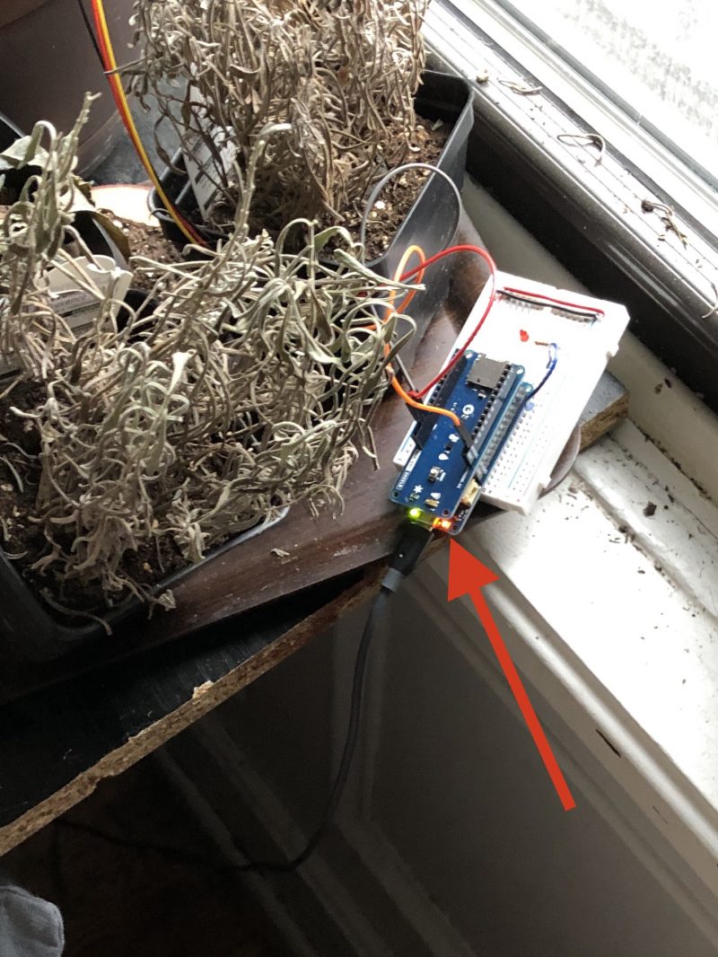
In Node Red, I tried to get my LED to blink in different patterns. I added the LED code back to my Arduino plant sensor code, but wasn’t able to get it to work. My issue was getting a qualifier to get accepted by JavaScript. Since I’m far from a JS whiz, I used one of our examples (the high temperature alert) from class as a baseline and went from there.
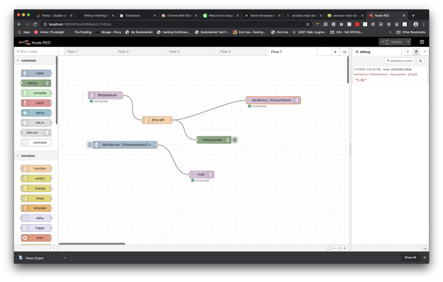
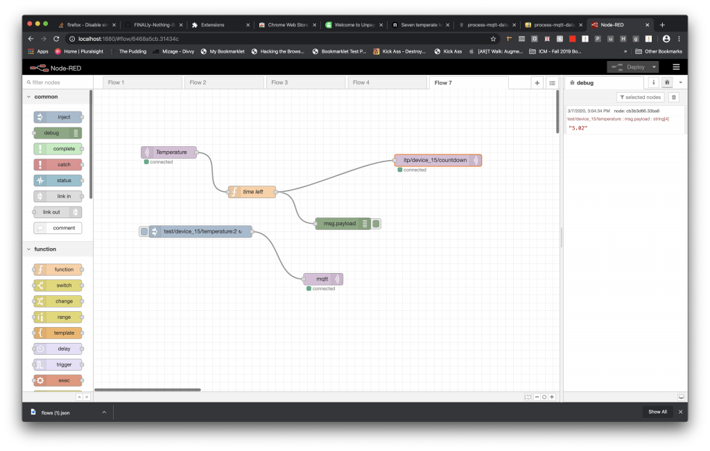
In the end, I reformulated and played in Node Red for a couple hours. The code I created used temperature as a qualifier to set in action a script that every six hours will send the time, in days, left in our course.
Here’s a screenshot of my final design:
Here’s the exported code:
[

    {

        "id": "7ab5ee3b.df242",

        "type": "function",

        "z": "6468a5cb.31434c",

        "name": "time left",

        "func": "const temperature = Number(msg.payload);\nconst endOfClass = new Date('March 12, 20 14:40:00 GMT-04:00');\nconst now = Date.now();\n\nif(temperature > 1) {\n    \n       let timeLeft =  endOfClass - now;\n       timeDiff = Number(timeLeft);\n       \n       msg.payload = (timeDiff/86400000).toFixed(2);\n       return msg;\n\n} else {\n    return null;\n}",

        "outputs": 1,

        "noerr": 0,

        "x": 400,

        "y": 260,

        "wires": [

            [

                "cb3b3d66.33ba6",

                "88678c5d.77e1a"

            ]

        ]

    }

]

