This week, I (ok, yet again) really struggled with getting through the next stage of ideation and process development. This was mainly because I was unable to narrow-down my thoughts into a cohesive concept. I found myself wanting to have an app that, at the end of the day, does everything… and discovered that it would really take a motivated user to download and use the app I was proposing. Instead, if I could make an app with a clearer, more-straightforward application, I might have better luck!
Finding myself stuck and not excited about what I’d been working on, I reached out to my professor about meeting to go over what I had and ended up meeting with Katherine for about 45 minutes. During which time, we went over the ideas that I had come up with over the weekend and talked through what my thought process was. I expressed to her my interest in a project I’d heard about through a cool food/science podcast (thanks to Dan Fries for pointing me to that!)
From the podcast, I learned, in Chile, they have used a series of labels placed on food packages to warn consumers about products that are high in saturated fat, sodium, calories, and/or sugar. Knowing that such an initiative would be very hard to implement here (think: freedom of speech issues, for one), I wanted to somehow utilize the idea of a simple, clear label to educate consumers.
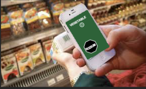
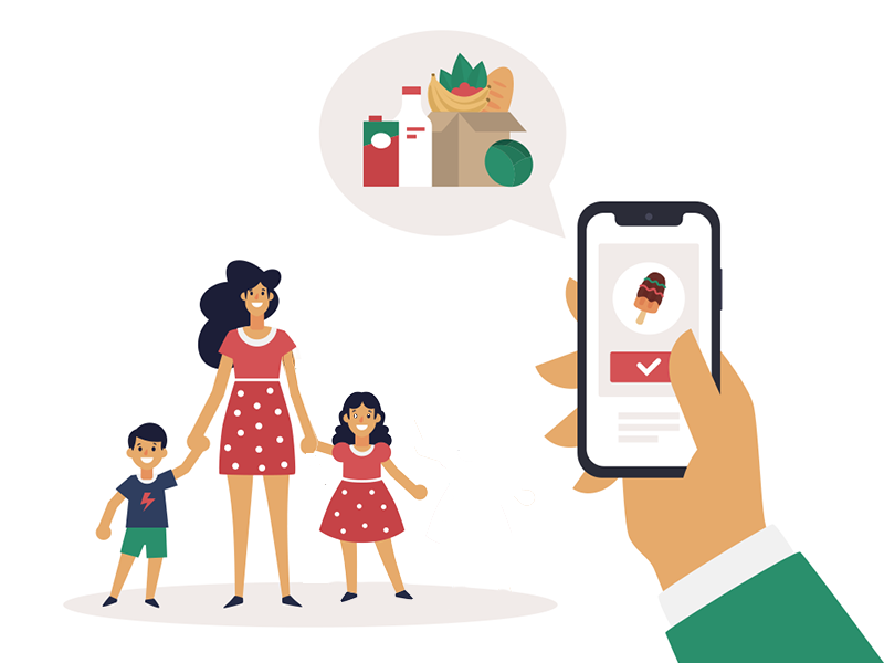
What I came up with was an idea for a Food Filter app that would allow users to scan foods (either through packaging recognition or barcodes/produce codes) and quickly find out whether they are primarily considered a Protein, Vegetable, Carbohydrate, or Dessert. Right now, the concept is to display a color filter on top of the screen corresponding to the type of nutritional element the food is (for example, Protein would be red, Vegetable would be green, Carbohydrate would be blue, and Dessert would be orange.) They’ll also be alerted if the product is high in saturated fat, sodium, calories, and/or sugar by having warning badges (in the shape of black stop signs) appear on the screen as well. If no badges appear, they’ll instead see a “healthy option” sign for products. There will also be a range of happy to distressed faces to help make clear how healthy of an option the food is.
Down the road, this concept could be expanded to include different types of filters to aid in grocery shopping. For example, there could be filters which screen for family food allergens or whether items are vegan or kosher. For now, this product allows families to make grocery shopping a collaborative and educational activity that benefits everyone.
Here’s the user flowchart, which I’ve combined with the mood board elements:
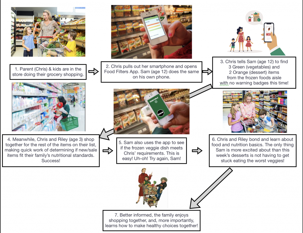
Here’s a link to the PDF version – DMI Storyboard Flow – Week 4
