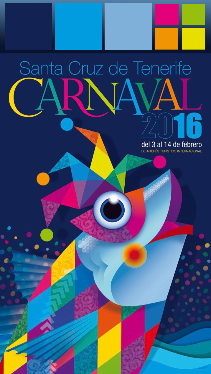
For my Design Analysis assignment this week, I decided to use one of my favorite posters from Carnaval from Santa Cruz de Tenerife in the Canary Islands. Though fairly unknown to most Americans, Carnaval in the capital city of Tenerife is considered the second most popular celebration of Carnival in the world, after Rio de Janeiro, Brazil. Every year, a much-anticipated official poster is released and plastered all around town, announcing the dates of festivities and building excitement for what is, by far, the largest event of any kind in the Islands.
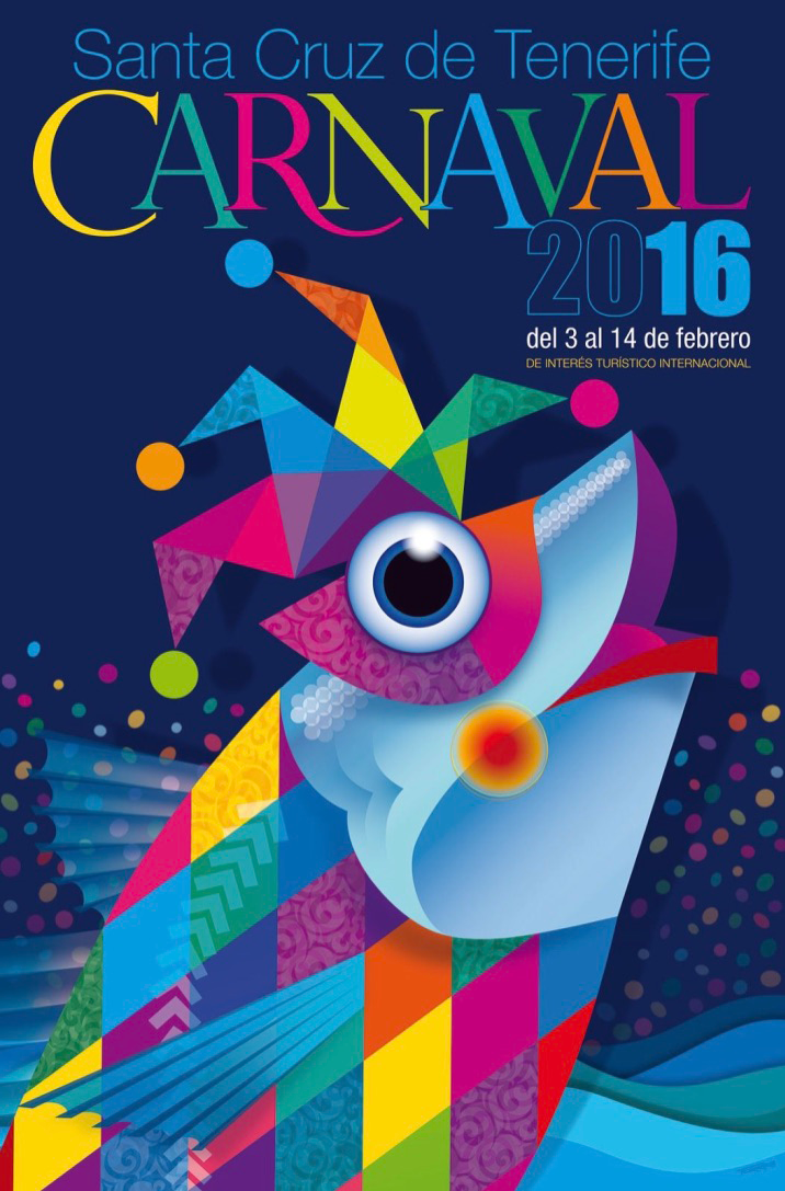
I was an exchange student in Santa Cruz many (many) years ago and am still in close contact with my host family there; in fact, they still have a room in their home for me. The past several years, I’ve been fortunate enough to attend Carnaval and picked my favorite poster to be the subject matter of this post–it’s the official poster from 2016. I particularly like this poster for the simplicity of design, subject matter, and the color pallet used.
While this poster contains very little information, it still displays the information most people are wanting to know. This poster’s hierarchy is simple; it makes clear what it’s about, Carnaval, and gives the information everyone wants to know, the dates–in fact, the latter bit of info is the only line of bright white text contrasted against the dark, navy background on the entire poster. As Carnaval is an annual tradition, all the local residents know where the festivities are held (downtown, just follow the people in costumes), but since Carnaval is held during the week of Ash Wednesday (which is the start of Lent, which ends just before Easter), its dates on the calendar, like Easter’s, change every year. (The other bit of information on this poster signifies that it’s an official poster brought to you by the Board of Tourism.)
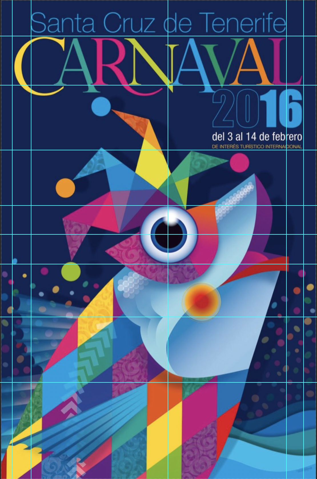
In terms of layout, for a poster with so many different angles and shapes, the underlying grid system is quite structured. The eye of the fish (the sardine, a major piece/symbol of the Carnaval celebrations) is placed in the middle of the image. The distance from the center of the sardine’s eye to the middle of its gills is the same distance as from the middle of the eye to the bottom of the last line of text. Interestingly, the top of the sardine’s fin is also the same distance from the center of its eye as the bottom of the word “Carnaval.”
The designers of the 2016 poster for Santa Cruz’s week-long party opted to go with five lines of text–each line using a different font. I was unable to identify all of the fonts used in this poster, so I used both WhatTheFont and Whatfontis.com to try to identify the typefaces used. After running the images through both, neither had a good suggestion for the font for the word “Carnaval”. The font for the word “2016” is a very commonly-used font, Impact MT. And the remaining three lines of text on the poster all happen to be from the same family, Nimbus Sans Novus.

In terms of color, it’s primarily shades of dark and light blue with several accents of color. The blue seems appropriate not only because fish, like our friend the sardine, live in the water (which is usually represented by the color blue), but the downtown areas where the festivities are held on the island are also on the water. As Carnaval is a lively festival, usually celebrated at night, when hundreds of thousands of people fill the streets in elaborate, colorful costumes, the vibrant colors serve as an appropriate juxtaposition to the dark backdrop.
Link to Slide Presentation: https://docs.google.com/presentation/d/1-xqsE0VMlcQMBongtlxE-gW1wgN2zXUA25AEFbZI-ts/edit?usp=sharing


